App Config
Learn how to edit your application configuration with Nuxt Studio.
What is App Config ?
The app.config.ts file is a new configuration file introduced in Nuxt 3. It's a TypeScript file that allows you to configure various aspects of your application settings. Developers can easily turn any website into a configurable experience using this file.
Schema generation
To create a customized editing experience for your app.config.ts in Studio, you need to create a nuxt.schema.ts file in your project. This schema serves as a representation of your app.config.ts. It is not mandatory to include all app config keys; only those you wish to showcase on the Studio interface need to be added.
Helpers
- The
groupmethod allows you to customize parent objects. - The
fieldmethod allows you to customize inputs (aka leaf).
import { field, group } from '@nuxthq/studio/theme'

export default defineNuxtSchema({
  appConfig: {
    parent: group({
      title: 'Parent title',
      description: 'Parent description.',
      icon: 'i-icon-to-display',
      fields: {
        leaf: field({
          type: 'Type of component used to edit your field',
          title: 'Field title',
          description: 'Field Description',
          icon: 'i-icon-to-display',
          default: 'default value'
        })
      }
    })
  }
})
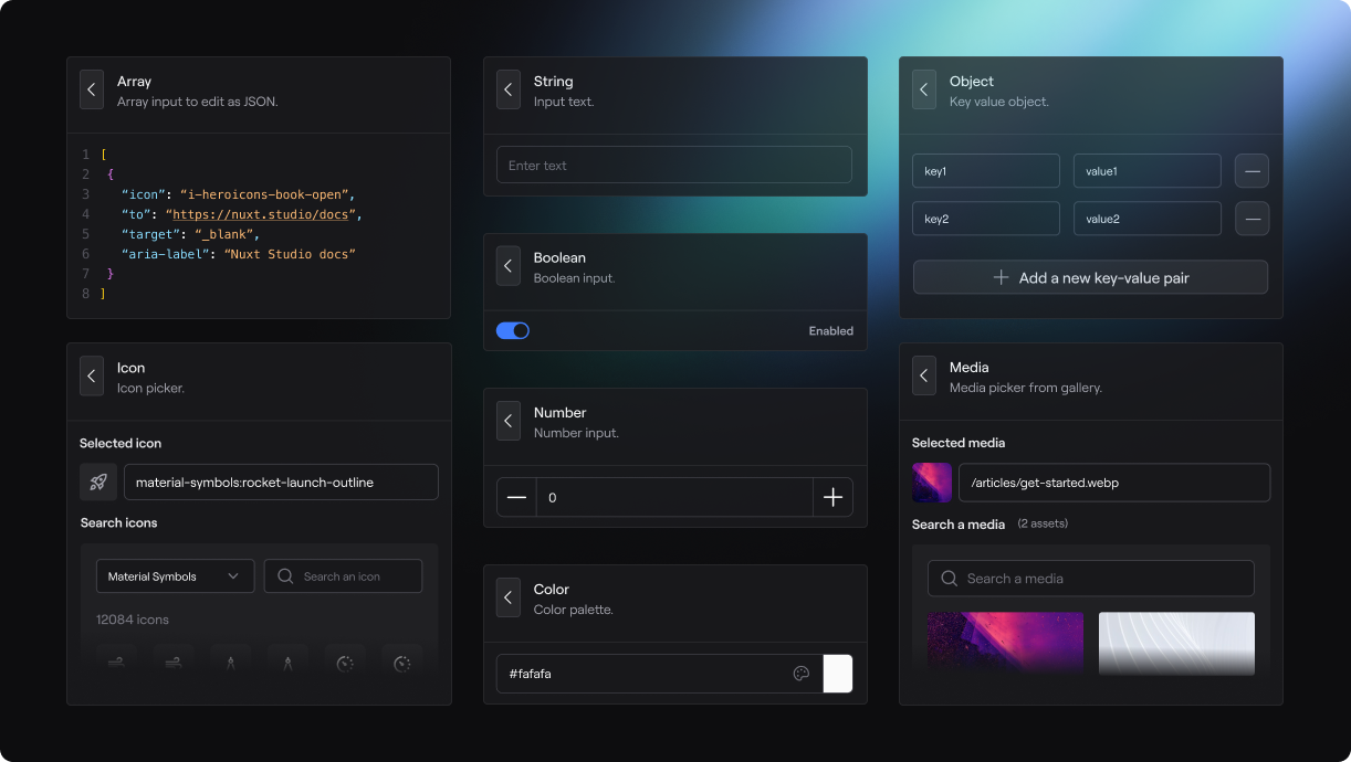
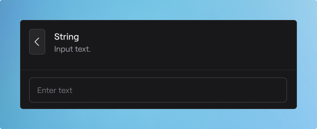
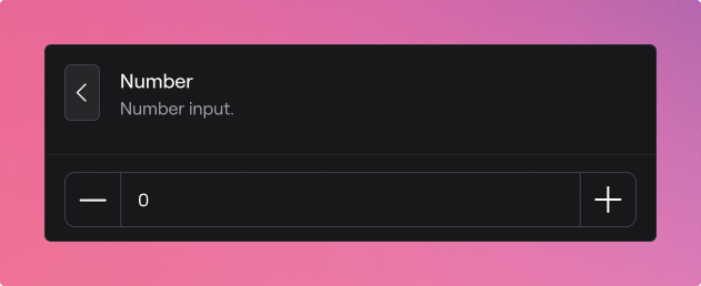
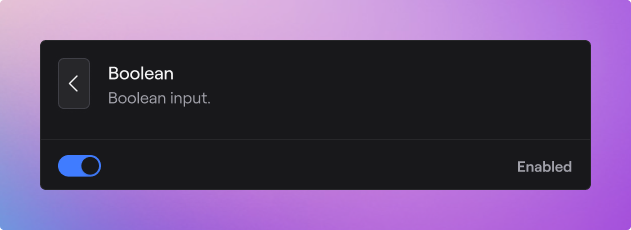
Input Types
The type in the field() method's first parameter can accept various values:
string
Text can be displayed as a select instead on a classical input if you provide a required key in the field() method:
import { field, group } from '@nuxthq/studio/theme'

export default defineNuxtSchema({
  appConfig: {
    parent: group({
      title: 'UI',
      description: 'UI configuration',
      icon: 'i-mdi-palette',
      fields: {
        primary: field({
          type: 'string',
          title: 'Primary',
          description: 'Primary color of your UI.',
          icon: 'i-mdi-palette-outline',
          default: 'sky',
          required: ['sky', 'mint', 'rose', 'amber']
        })
      }
    })
  }
})
number
boolean
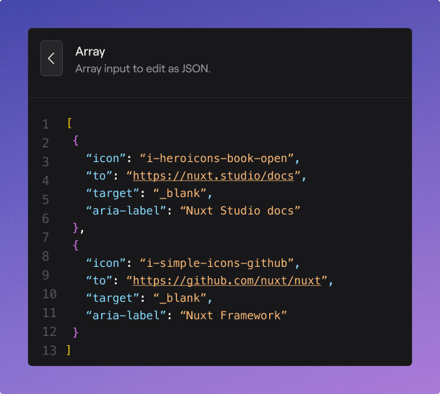
array
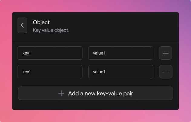
object
icon
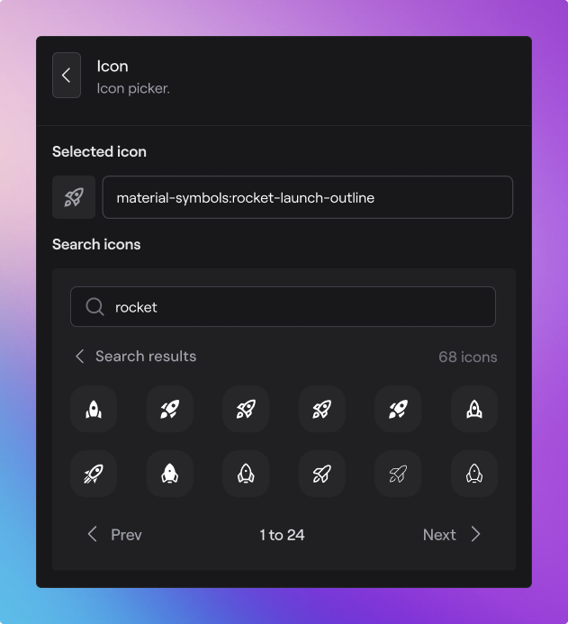
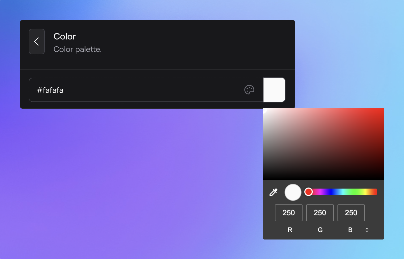
color
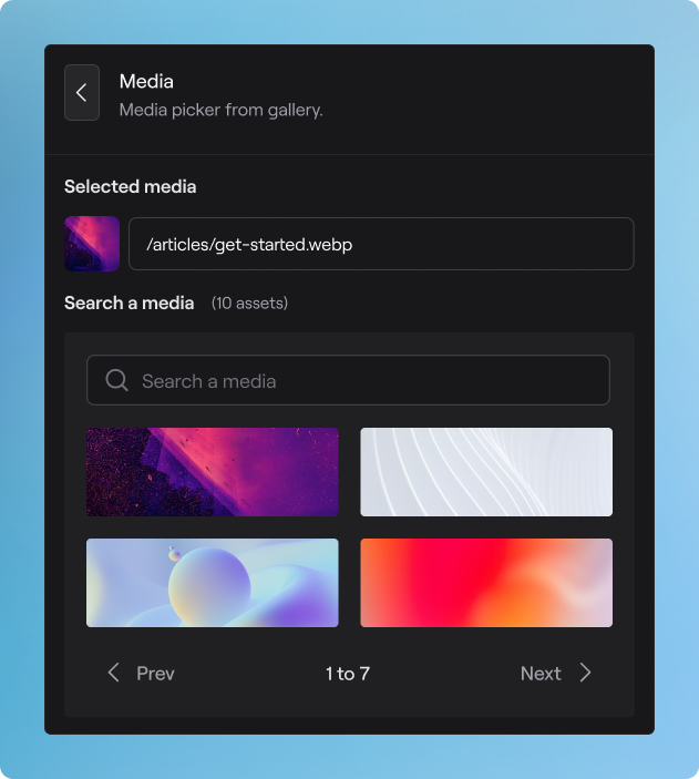
media
Demo
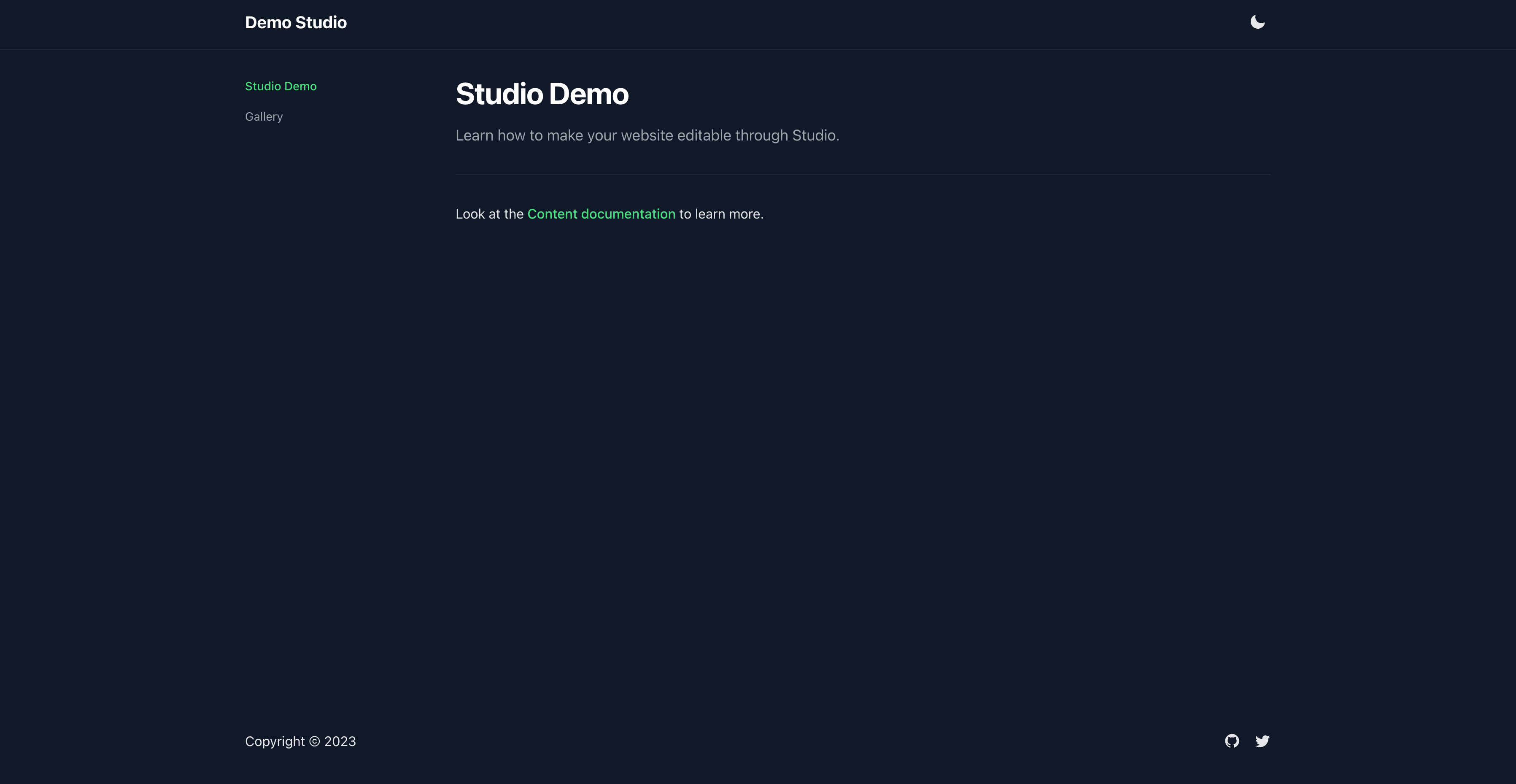
In the previous section, we enhanced the minimalist starter, making it more visually appealing and empowering users to edit the content. Now, how about extending the capability to Studio users, allowing them to personalize the website's design themselves?
Let's do it with a brand new app.config.ts file:
export default defineAppConfig({
  header: {
    title: 'Demo Studio',
    icon: 'tabler:brand-nuxt'
  },
  footer: {
    display: true
  },
  socials: {
    github: 'larbish',
    twitter: '_larbish'
  }
})
We created an object to configure:
- The header title
- The header icon
- The footer display
- The socials
Let's modify the existing app.vue file to integrate those configs:
<script setup lang="ts">
const { header, footer, socials } = useAppConfig()
</script>

<template>
  <div>
    <UHeader>
      <template #logo>
        <Icon v-if="header.icon" :name="header.icon" class="h-10 w-10" />
        <span v-else>
          {{ header.title }}
        </span>
      </template>
      <template #right>
        <UColorModeButton />
      </template>
    </UHeader>
    <UMain>
      <NuxtPage />
    </UMain>
    <UFooter
      v-if="footer.display"
    >
      <template #right>
        <div class="flex items-center justify-center gap-4">
          <UButton
            v-if="socials.github"
            icon="i-mdi-github"
            :to="`https://github.com/${socials.github}`"
            color="gray"
            variant="ghost"
            target="_blank"
            :padded="false"
          />
          <UButton
            v-if="socials.twitter"
            icon="i-mdi-twitter"
            :to="`https://twitter.com/${socials.twitter}`"
            color="gray"
            variant="ghost"
            target="_blank"
            :padded="false"
          />
        </div>
      </template>
    </UFooter>
  </div>
</template>
Next, we need to create the AppConfig schema in order to give Studio users the ability to visually edit it.
Let's create our nuxt.schema.ts file:
// nuxt.schema.ts
import { field, group } from '@nuxthq/studio/theme'

export default defineNuxtSchema({
  appConfig: {
    header: group({
      title: 'Header',
      description: 'Header configuration',
      icon: 'i-mdi-page-layout-header',
      fields: {
        title: field({
          type: 'string',
          title: 'Header',
          description: 'Header title to display if no icon is provided',
          icon: 'i-mdi-format-title'
        }),
        icon: field({
          type: 'icon',
          title: 'Icon',
          description: 'Header icon',
          icon: 'i-mdi-image-filter-center-focus-strong-outline'
        })
      }
    }),
    footer: group({
      title: 'Footer',
      description: 'Footer configuration',
      icon: 'i-mdi-page-layout-footer',
      fields: {
        display: field({
          type: 'boolean',
          title: 'Display',
          description: 'Hide or display the footer',
          icon: 'i-mdi-page-layout-footer'
        })
      }
    }),
    socials: group({
      title: 'Socials',
      description: 'Social links',
      icon: 'i-mdi-web',
      fields: {
        twitter: field({
          type: 'string',
          title: 'Twitter',
          description: 'Twitter social handle',
          icon: 'i-mdi-twitter'
        }),
        github: field({
          type: 'string',
          description: 'Github social handle',
          icon: 'i-mdi-github'
        })
      }
    })
  }
})
Let's push these changes to our repository and test them within Nuxt Studio once the deployment is complete!